
01
Platform: Browser, Steam, Mobile · free
Cookie Clicker's right-hand store lists every building in order, greys out what you cannot afford, and offers buy and sell in quantities of 1, 10 and 100. Its wiki gives the exact maths: because each building costs 15% more than the last, buying 10 costs about 20.3 times the current price. Upgrades sit in a row of icons above the buildings.
It solves the problem of hundreds of purchases. Bulk buttons cut clicks by two orders of magnitude, and the fixed order means players always know where to look. Nearly every idle game since has a version of this column.
Watch out for: Show the real total price on the button when bulk buying is selected. Showing the single-unit price is one of the most common idle UI bugs.

02
Platform: Browser, Mobile · free
A Dark Room opens with almost nothing: a line of text and a button to light the fire. New buttons, panels and eventually a map appear only when they become useful. Its designer, Michael Townsend, aimed to tell the story 'entirely through environmental cues', and the UI is the main cue.
It solves information overload. A new player sees one choice, then two, then a village. It is open source under MPL-2.0, so you can read exactly how the reveal is staged.
Watch out for: Hidden features need a nudge. When something new appears, mark it (a glow, a 'new' badge) or players miss it.
03
Tabs, one per system: best for deep games with many parallel systems
Platform: Browser, Mobile · free
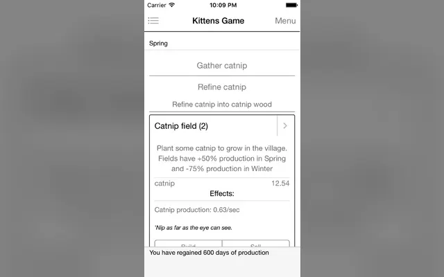
Kittens Game gives each major system its own tab: its strings include Science, Workshop, Trade, Religion, Space, Time, Challenges, Achievements, Stats and a build Queue. Tabs appear as you unlock them, so the top bar doubles as a map of how far you have come.
It solves the problem of a game that grows for months. Each tab can be dense because it only shows one system, and players learn the layout one tab at a time. The source is on GitHub.
Watch out for: Ten tabs need a way to show where attention is needed. Add a small indicator on tabs with something affordable or a full storage bar.
04
Platform: Browser, Steam, Mobile · free
Antimatter Dimensions lets players choose how numbers are written: scientific, engineering, letters, standard, mixed scientific, logarithm and more, plus joke notations such as emoji, Roman numerals, Zalgo text, blobs and a 'blind' option. Its source marks the hard-to-read ones as 'painful'. The notations are published as a separate MIT-licensed library.
It solves the readability problem of huge numbers. New players read named suffixes more easily; veterans compare exponents faster in scientific. A setting serves both, and the joke options make the settings screen part of the game's personality.
Watch out for: Every number on screen must go through the same formatter, including tooltips and modals, or the setting looks broken.

05
Platform: Browser, Mobile · free
When you return to Swarm Simulator, it tells you what your swarm produced while you were away, unit by unit. Antimatter Dimensions goes further with a modal that replays offline time as ticks and offers a skip button. Both turn a silent number change into a moment.
It solves the 'did anything happen?' problem. Offline progress is the genre's biggest reward, and a summary makes the player feel it. Swarm Simulator is free in the browser and open source.
Watch out for: Keep the summary short and dismissable. A long list of gains on every visit becomes noise; lead with the one or two biggest.

06
Platform: Browser · free
Shark Game: New Frontiers reworked the original Shark Game's interface with tooltips, a log panel and, in its developer's words on galaxy.click, a multiplier breakdown for its grotto. Players can see exactly which upgrades and animals are contributing to each resource.
It solves the 'why is this number what it is?' problem. Once a resource has five or more multipliers, players cannot reason about upgrades without seeing them listed. A breakdown turns guessing into planning.
Watch out for: Galaxy commenters criticised its multi-buy hotkeys and a table that does not scroll independently. Breakdown panels need room; test them on small screens.

07
The prestige map: best for games with many prestige layers
Platform: Browser · free
The Prestige Tree draws each prestige layer as a node in a tree, with lines showing which resets which. Clicking a node opens its upgrades. The Modding Tree template, built from it, has documentation for tree layout, subtabs, microtabs, bars, infoboxes and grids, so you can reuse the whole interface.
It solves the problem of explaining nested resets. A player can see at a glance what a reset costs and what comes next, instead of reading a wall of text.
Watch out for: Trees get wide. Plan for scrolling or zoom before you add your tenth layer.

08
Platform: Steam · paid
Nodebuster separates play from shopping. Runs are short and focused; between them, you 'Explore the upgrade skill tree', a large web of upgrades that grows outward as you buy. It holds 97% positive from about 14,000 Steam reviews.
It solves the problem of upgrade lists interrupting action. Putting the whole economy on one screen between runs keeps runs clean and makes shopping a satisfying ritual.
Watch out for: Show costs and effects on hover without tiny text. Big trees are often played on laptop screens where small labels are unreadable.

09
Platform: Mobile · free-to-play
Exponential Idle puts an equation at the centre of the screen. You advance time by tapping the equation or letting it run, and upgrades change its variables. The App Store listing describes the goal as stacking up money 'by taking advantage of exponential growth'.
It solves the problem of explaining why numbers grow. When the formula is the UI, every upgrade shows its effect in the expression itself. It is free on iOS and Android and rated 4.9 stars from about 4,100 App Store ratings.
Watch out for: Equations scare some players. Introduce one term at a time and label what each variable does in plain words.

10
Platform: Steam · free
Upload Labs presents its systems as window-like nodes for computer components and processes, which you connect from output to input to build data pipelines. The interface looks like a desktop full of small apps, which suits its theme of downloading, processing and uploading files.
It solves the problem of showing a production chain. Instead of a list of rates, the player sees resources flow along wires they placed. It is free to play and holds 90% positive from almost 4,900 Steam reviews.
Watch out for: Free-form node layouts become spaghetti. Offer snapping, grouping and a tidy button.

11
Platform: Steam, Mobile · paid
Stone Story RPG by Rex Games is 'an auto-RPG with strategic combat, deep crafting and programming elements, animated entirely in ASCII-art'. Its characters, effects and landscapes are hand-animated text, and you script your character's behaviour in its own language.
It solves the problem of looking memorable on a small budget. Text UI is the genre's native style, from Progress Quest to Candy Box 2, and Stone Story shows how far it can go when animated with care. It holds 91% positive on Steam.
Watch out for: ASCII art can fail screen readers and colour-blind players. Provide text alternatives for anything conveyed only by shape or colour.

12
The screen-edge strip: best for desktop idlers that share the screen
Platform: Steam · paid
Rusty's Retirement is designed to 'sit at the bottom of your screen while you do other things', with a vertical mode that sits at the side. The farm, the robots and the shop all live in one thin strip, so the player can glance at it without leaving their work.
It solves the problem of a game competing with everything else on screen. A strip is always visible and never in the way. It holds 97% positive from almost 15,000 Steam reviews.
Watch out for: A strip leaves almost no room for menus or text. Decide where every panel opens, and how it closes, before you build the first one.

13
Platform: Steam · paid
Desktop Defender runs in a small window in the corner of the screen. Its store page says you can adjust its size and position, and choose whether to play actively or passively. A single tower defends against waves; loot and Ascendium upgrades sit in compact panels.
It solves the problem that every player's screen is different. Letting them place and size the window means the game fits around their work, not the other way round. It holds 92% positive from about 1,800 Steam reviews.
Watch out for: Resizable windows need a layout that works at every size. Test the smallest supported size first; that is where the UI breaks.

14 · Ours
Platform: Browser, Steam
Mushies! is the site maintainer's own game, so read this as a case study. It is a cozy pixel-art clicker about a mushroom village, and its demo page lists colourblind-friendly design, subtitles, a high-contrast mode and an interactive tutorial, with a large red X to skip each dialogue box.
Clickers are often played by people who do not think of themselves as gamers, which makes accessibility options more important, not less. High contrast and skippable dialogue in particular cost little to build early. Mushies! is upcoming on Steam with a free browser demo on itch.io.
Watch out for: Rapid clicking itself is an accessibility problem. Offer a hold-to-click or auto-click option so players with limited mobility are not shut out.